Wednesday, 21 February 2018
Tuesday, 20 February 2018
Friday, 19 January 2018
Task 9: Producing the CD/ DVD digipak and Advert (PLANNING)
These are the inside of my album cover. I didnt want to go for a full look. I wanted a more mature and simple look to the album overall.
Thursday, 18 January 2018
Task 9: Producing the CD/ DVD digipak and Advert (PLANNING)
There were some issues for me taking my own photos because of the artist not being able to get days off and for the photography studio being open at certain times. For this, I had to change my idea of the album cover. I wanted a black
back drop but because this was no longer an option, I changed it to a location with a brick wall.
These are the ideas I have come up with.
back drop but because this was no longer an option, I changed it to a location with a brick wall.
These are the ideas I have come up with.
Friday, 12 January 2018
Task 9: Producing the CD/ DVD digipak and Advert (PLANNING)
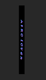
I have started on the spine of the album. I want this to stand out and still follow the font and colour that is repeated on the front and back cover.
Thursday, 11 January 2018
Task 9: Producing the CD/ DVD digipak and Advert (PLANNING)
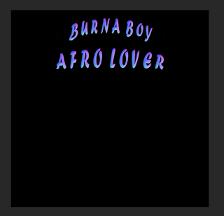
I have added an effect onto the writing and a colour. I like this colour but not too sure about the way its layed out.
This is my back cover. I have used a tool called 'Eye dropper Tool' I have let me take colours from the album title and use it on my other texts.
This is my back cover. I have used a tool called 'Eye dropper Tool' I have let me take colours from the album title and use it on my other texts.
Friday, 5 January 2018
Task 9: Producing the CD/ DVD digipak and Advert (PLANNING)
In today's lesson, i started off with playing with one font and changing where to put it. I prefer the bottom one but I am less likely to place it on the bottom because when i put in the bar code I am more likely to follow the typical conventions of the extras being at the bottom.
Thursday, 4 January 2018
Pitch Feedback
Subscribe to:
Comments (Atom)


